Wuhan Biennale 2022
武漢雙年展 2022
Wuhan
2022
CD 肖勇
AD 王小楓
GD 王天甲、劉馨元、陳一瑋、郭澳城、丁邦根
C 武漢雙年展
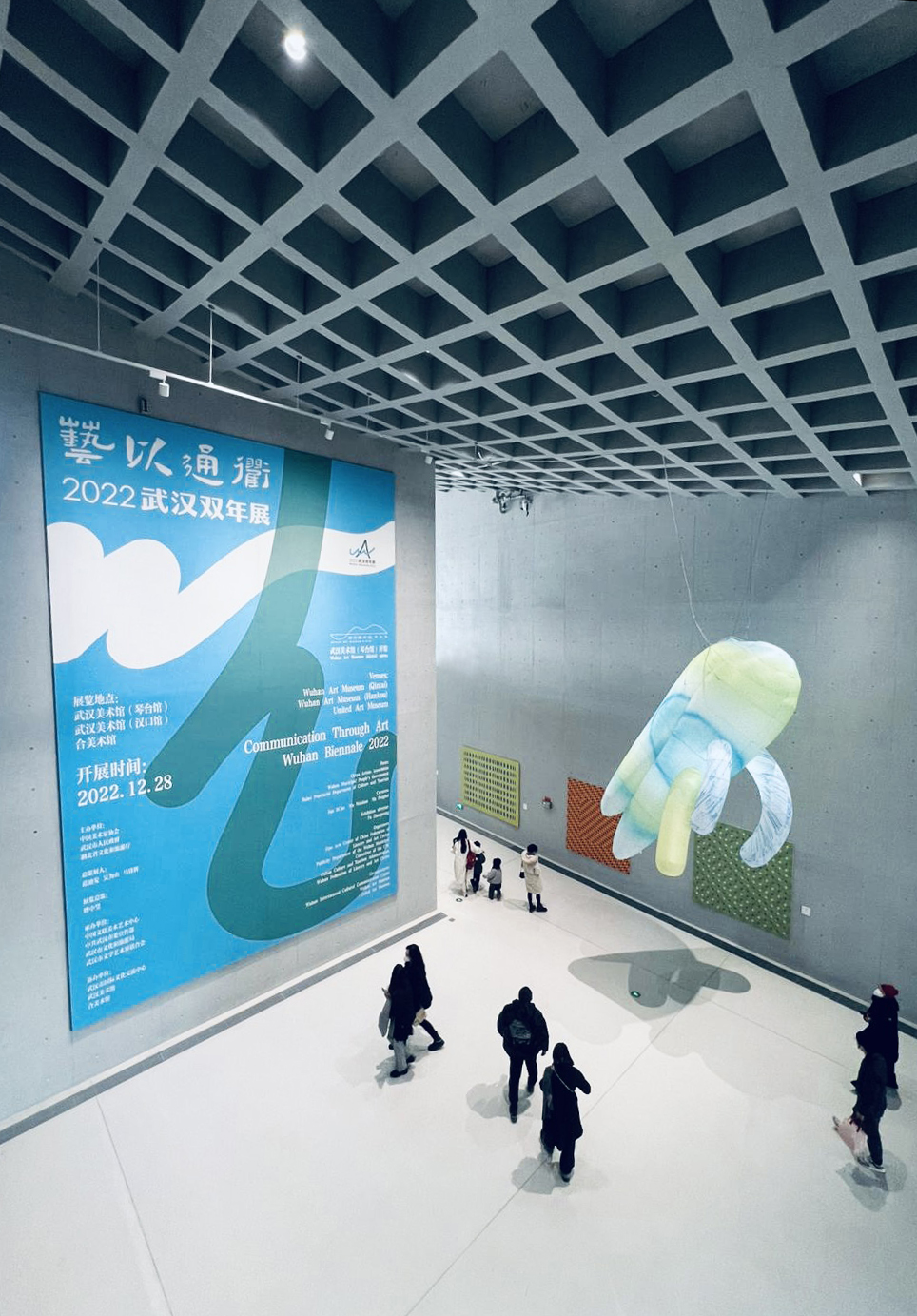
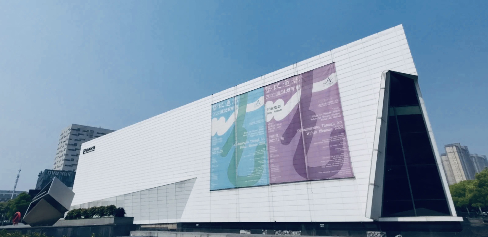
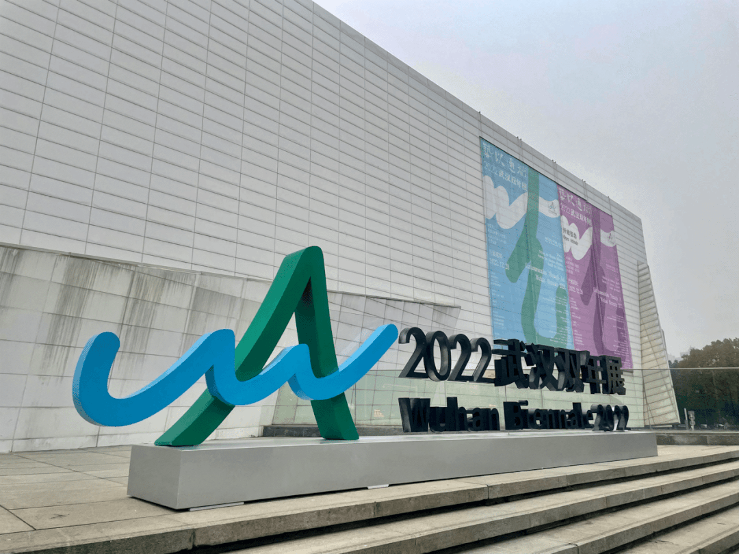
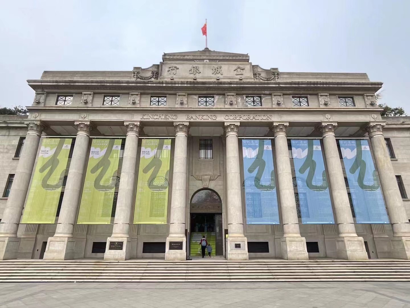
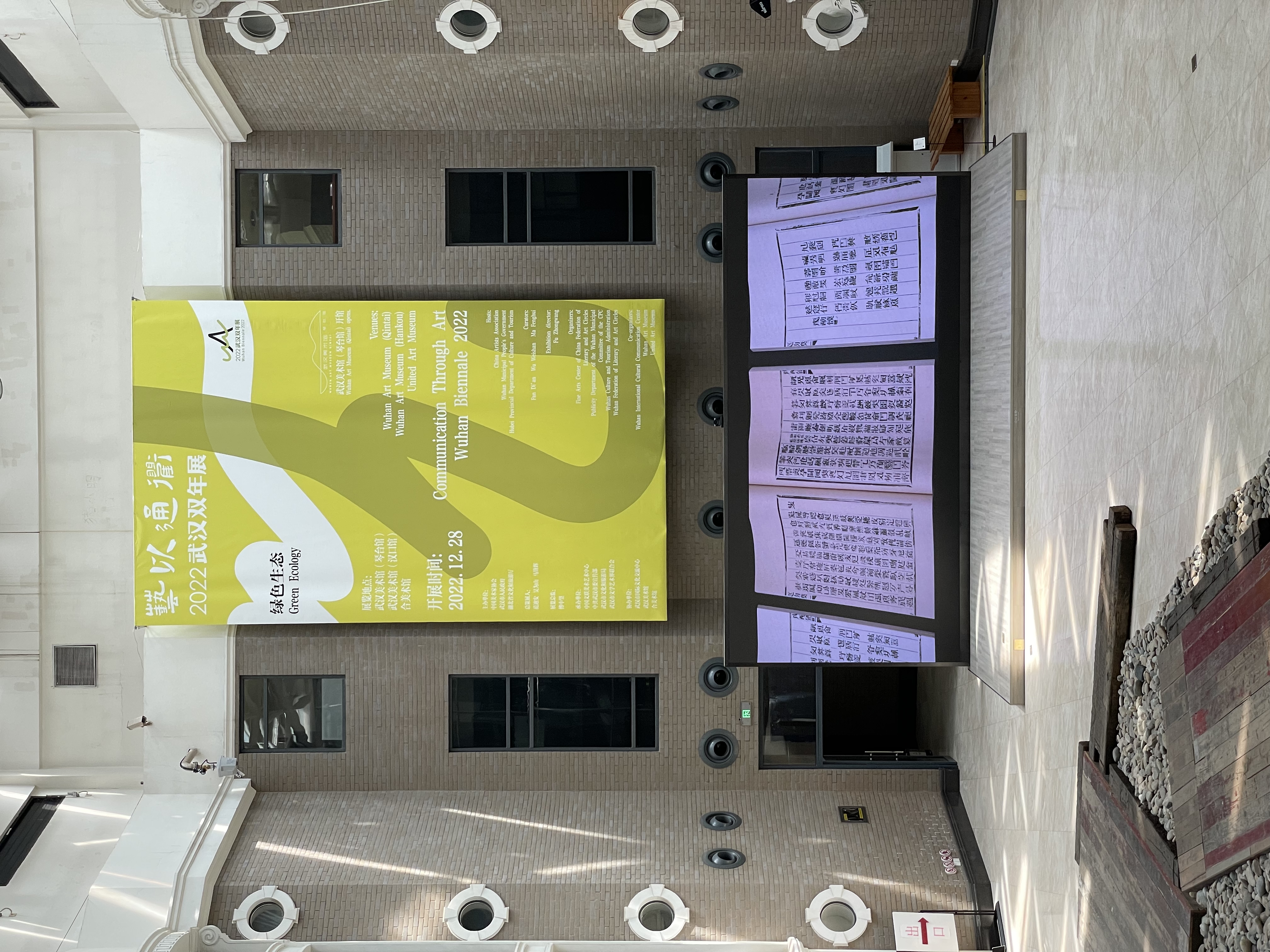
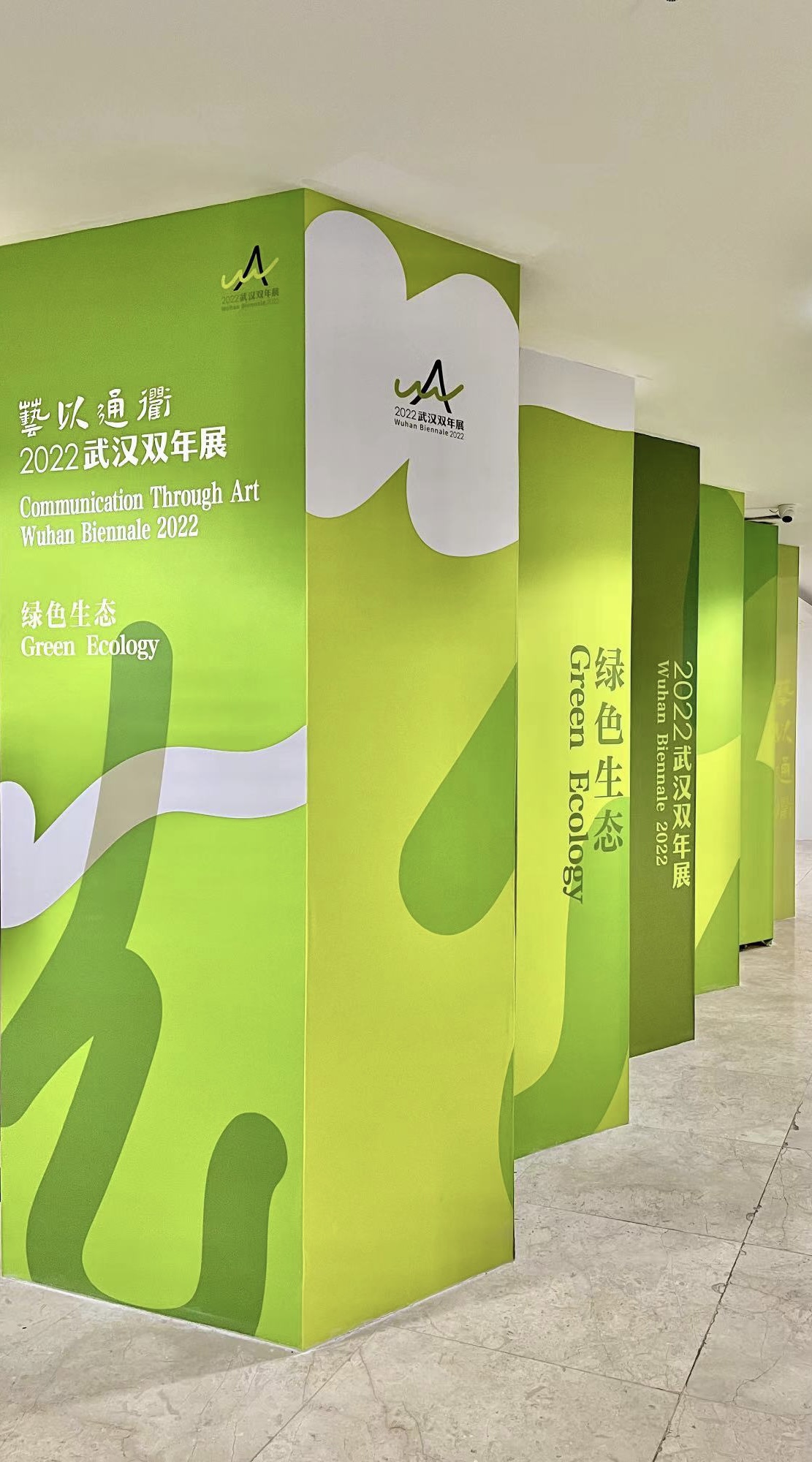
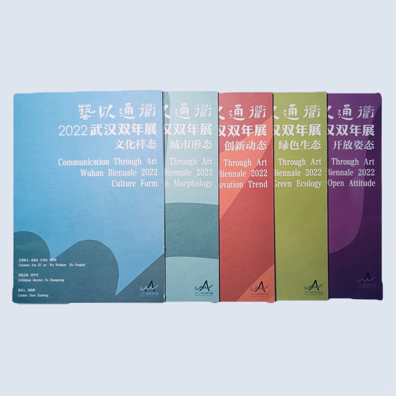
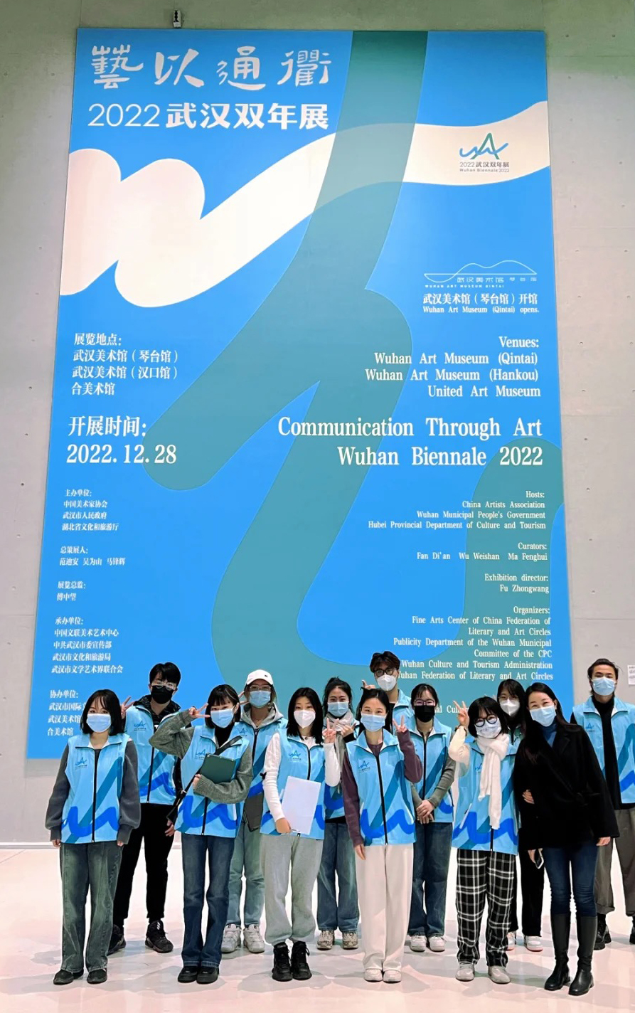
The visual design adheres to the aesthetic temperament of Chinese freehand landscape, and continues the main logo image of the Biennale "Looking for bosom friends with high mountains and flowing water" and "Freehand brushwork with blue mountains and blue waters". The "w" and "h" of Wuhan (Wu Han) are combined into "art", the fusion of art rivers, the harmony of ecological beauty and artistic beauty. The series of colors originate from the images of the five elements and express different themes. High mountains and flowing waters find friends, and Wuhan prospers when two rivers meet. The green mountains and green waters are picturesque, and the traditional and contemporary blend together. Logos, posters, guidebooks and other visual designs reflect the communication needs and style characteristics of the Biennale, conveying a unique and charming image of the Art Biennale.
視覺設計秉承中國寫意山水美學氣質,延續雙年展“高山流水覓知音”“山青水藍大寫意”的主標識形象。武漢(Wu Han)的“w”和“h”組合成“藝”,藝術江河的融合彙聚,生態美與藝術美的和諧。系列色彩源於五行意象,表達不同主題。高山流水覓知音,兩江交匯武漢興。青山綠水如畫美,傳統當代碰交融。標誌、海報、導覽手冊等視覺設計體現雙年展的傳播需求和風格特點,傳達獨特且富魅力的藝術雙年展的形象。
視覺設計秉承中國寫意山水美學氣質,延續雙年展“高山流水覓知音”“山青水藍大寫意”的主標識形象。武漢(Wu Han)的“w”和“h”組合成“藝”,藝術江河的融合彙聚,生態美與藝術美的和諧。系列色彩源於五行意象,表達不同主題。高山流水覓知音,兩江交匯武漢興。青山綠水如畫美,傳統當代碰交融。標誌、海報、導覽手冊等視覺設計體現雙年展的傳播需求和風格特點,傳達獨特且富魅力的藝術雙年展的形象。